“Picture perfect” images and graphics on Social Media
If you’ve ever heard the idiom “A picture is worth a thousand words” there is no truer sense of the word when associated with content marketing. The last thing you want is an image that doesn’t properly fit on your blog or looks out of place on social media.
There’s no doubt about it: photos and images help your content marketing efforts get attention. Much more attention!
That’s why it’s important to make sure you not only have photos on your blog posts, but that they are properly formatted to avoid some of the problems commonly seen when you share your links on social media. I’ll give some examples of those issues below and how you can avoid them.
The right image
Almost always, I try to avoid using any graphics with text on them. One of the chief reasons is that Facebook will charge you more when boosting your post… or worse, they will not allow you to use it as part of an advertising campaign.
Don’t ask me why, but that’s their rules. We have to play by them.
The other reason is to avoid having text “chopped off” when your link is shared. Therefore, you’ll notice that I refer to “photos” below, but this pertains to any graphic image. Less text is better: no text is best. Leave the typing to what you write in your blog or the description within your post.
It all starts with your blog
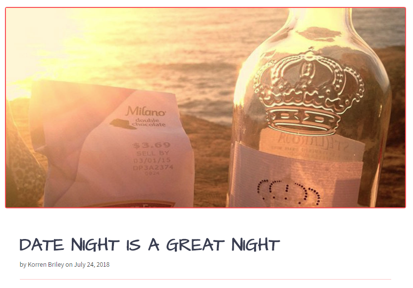
If your image isn’t properly formatted on your blog, then it won’t be properly formatted on the various social media networks you may share it on.
For those of you using WordPress, Facebook will traditionally look for the first image in your blog posts and associate it when sharing. Ditto for other platforms such as Twitter and Google Plus.
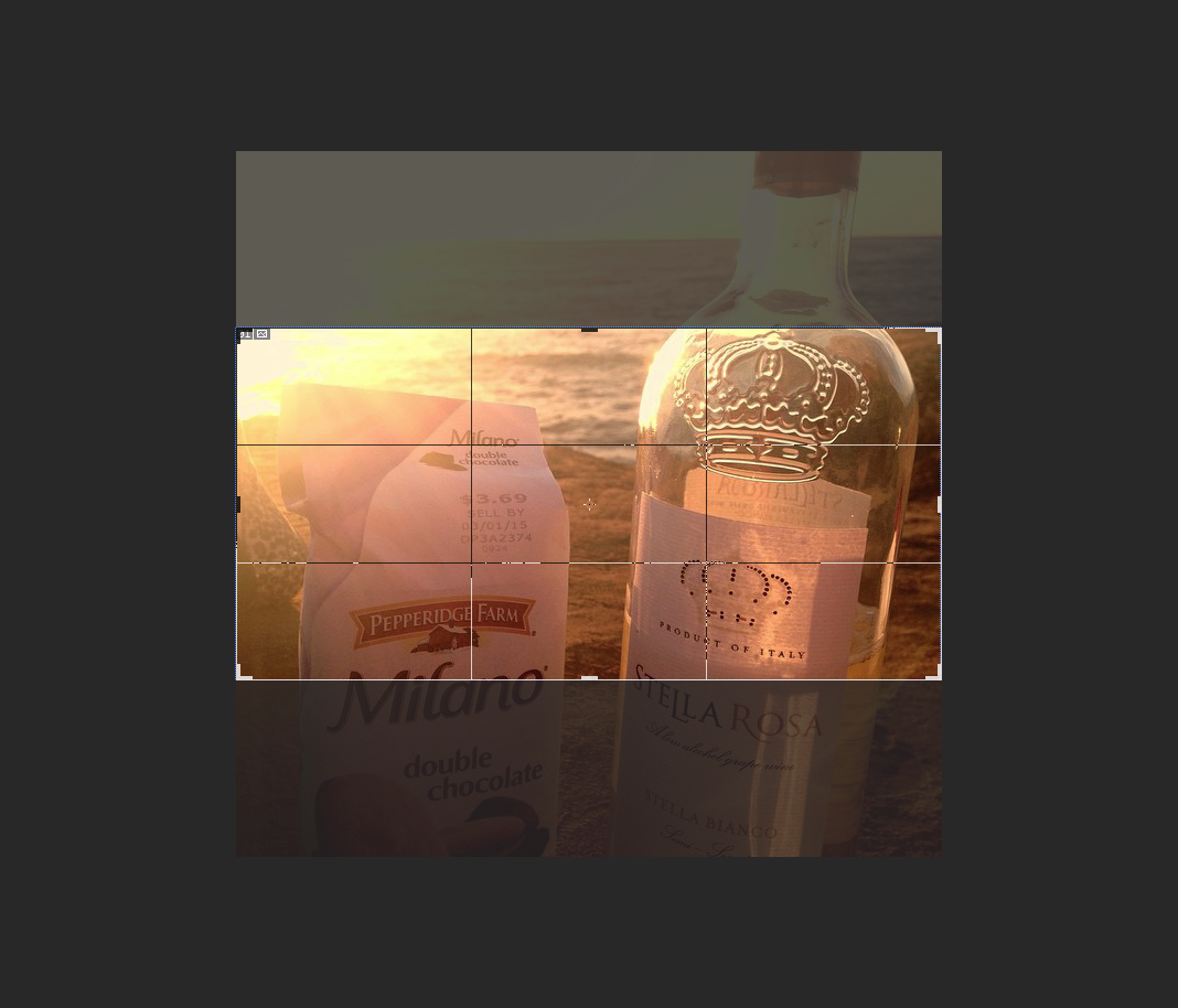
Therefore, it’s imperative that image is formatted correctly. I’ve found that a landscape-oriented image with a size of 1024px by 512px is the optimal size when sharing your posts across platforms. Facebook can handle any square image so long as it’s at least 600px wide on one side, however, Twitter will crop square images, particularly on their mobile applications.
There are many imaging programs which will allow you to crop your photos to this specific size. One popular option is Adobe Photoshop, which is a commercial application. For those on a budget, you can try open source or free programs such as GIMP, XnView or Microsoft Paint (or its newest incarnation, Paint 3D).
There is also a plethora of smartphone apps which can do the same: a simple search should be able to show you which ones are available. From there, it’s just a matter of personal preference as to which one is more user friendly and fits your needs.
Once you have a 1024×512 image, its time to place the photo in your blog. For the 70% or more of you out there, chances are you’re using WordPress. That means you will have a featured image box from which to set the main graphic associated with your post.
That box is usually part of the sidebar and looks like this:

To help Facebook and Twitter know your featured image is the “main photo” to accompany your blog post, you can also install the Yoast SEO Plugin. Once activated simply double-check that Facebook Open Graph meta data and Twitter card meta data are both enabled under Yoast’s social settings section.
This is a one-time setting, so once you save the changes, all of your blog posts (past, present or future) will have those social meta tags included.
That’s it! Now you’re set to share your post. However, let’s look at what some of the downfalls of not using properly formatted images might look like.
Using small images
I probably see this more often than I should. With the advent of high definition computer and smartphone screens its as important as ever to not use tiny “postage stamp” sized images on your blog.
Or else, this is what will happen:
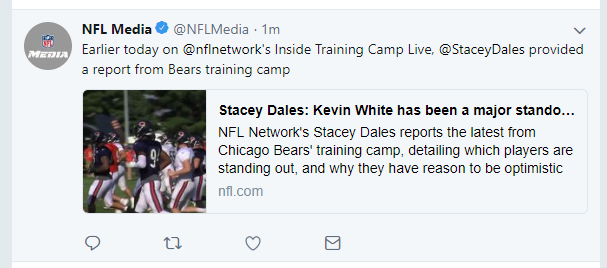
You will need images that have a good resolution but are not too big either. As you can see, this is far less eye-catching as when a properly formatted image is used:

(Note: while these examples are from Twitter this will appear similarly on Facebook too.)
Also keep in mind: bigger doesn’t always mean better.
The reason I recommend images sized 1024px in width is that embedding large images on your website will slow it down. When your page load speed decreases, your SEO will be penalized. It’s a careful balance as you want to be found by Google and look good on social media.
WordPress can only handle certain sized images internally too. If you upload an image that’s too big, it may get rejected or worse, crash your website. So be careful in making sure you format your images before uploading them to your blog.
Avoid Text
This post not only ignores the size of the image but also fails to consider text being cropped:
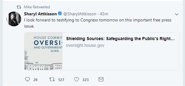
There’s no benefit to adding wording to your images if they are featured images for your blog. A post or banner added to a social media post promoting an event without a link, of course, is acceptable. It may still be governed by the same rules as sharing links, but in many cases an event flyer or poster is a necessary evil to share. (Just be aware of how cropped images could make your presence look less than professional.)
In any other situation you should attempt to put necessary text within the description of the social media post followed by the shared URL. In this way, your message won’t get truncated.
The Wrong Format
Nothing could be more embarrassing than having someone’s head chopped off in a photo:
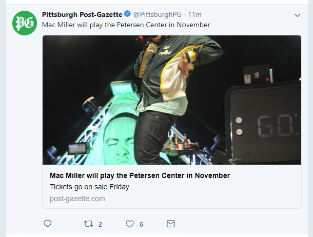
While this may still happen on some devices even with the recommended 1024×512 image size, your chances are greater that it will not.
Therefore, heed my advice throughout this article in optimizing your images before putting them on your blog or sharing them on social media.
By Joe Kuzma
Hello! My name is Joe Kuzma, and if you’re reading this, thank you! I’m pleased to virtually meet you and I hope we get to know one another well throughout this crazy journey of producing content.